Overview
Over the course of this 2-month academic project, our primary goal was to evaluate the Zillow app, identifying and unraveling any usability issues that may disrupt the users’ home search experience. Collaborating as a team of 4, we meticulously planned and executed usability testing sessions with 6 participants via Zoom, adapting to the challenges posed by the COVID-19 pandemic.
My Role
My role encompassed developing scripts outlining scenarios and tasks, moderating the sessions, and synthesizing prevalent issues observed from the sessions. Following my completion of the course, I dedicated my personal time to redesign some of the interface that had usability concerns using Figma to implement design recommendations that came out of the usability testing.
Methods
Survey, Usability Testing, Prototyping (Figma)
Objectives
Before delving into the usability study, our team conducted an informal heuristic evaluation of the app to gain insights into user goals and identify pain points. Based on our understanding of user objectives and identified usability issues, our focus for the usability study was threefold:
- Evaluate Zillow’s learnability and ease of use
- Identify prevalent pain points and tasks that illuminate these issues
- Provide actionable recommendations to enhance the overall user experience
Study Design
Each participant completed one session that was approximately 90-minutes long. The two groups of participants (Renters & Buyers) completed different sets of tasks based on their goals. Each session consisted of four different parts:
- Introduction
- Tasks
- Free Play
- Post-test Interview
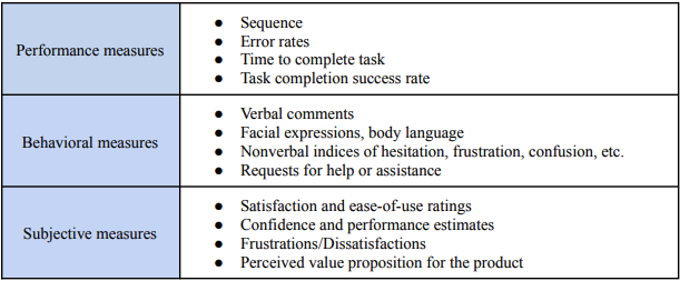
Three different types of measures were used to assess the usability of the Zillow mobile app: performance measures, behavioral measures, and subjective measures.
Results
From our usability testing sessions, we discovered three prevailing themes encapsulating the issues commonly encountered by the participants: difficulty understanding app-specific terminology, unintuitive discoverability of app features, and difficulty navigating through the app.
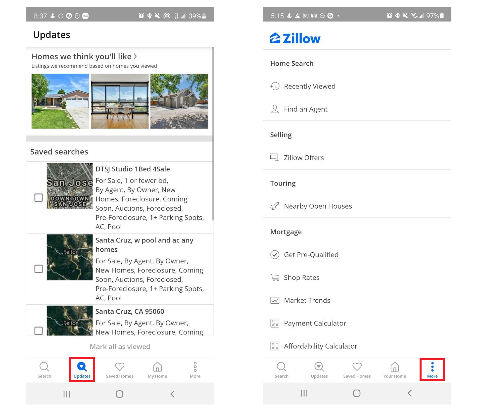
Updates tab - All renter and buyer participants encountered challenges in locating their previously saved searches, which was unexpectedly placed under the “Updates” tab.
More tab - All buyer participants had difficulty finding essential tools like “Find an Agent”, “Affordability Calculator”, “Payment Calculator” located under the “More” tab.
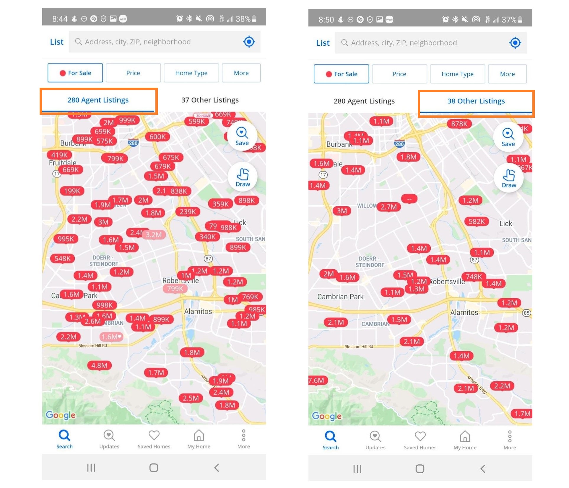
“Agent” versus “Other” Listing - Buyer participants experienced confusion when distinguishing between agent listing and other listings while browsing for homes.
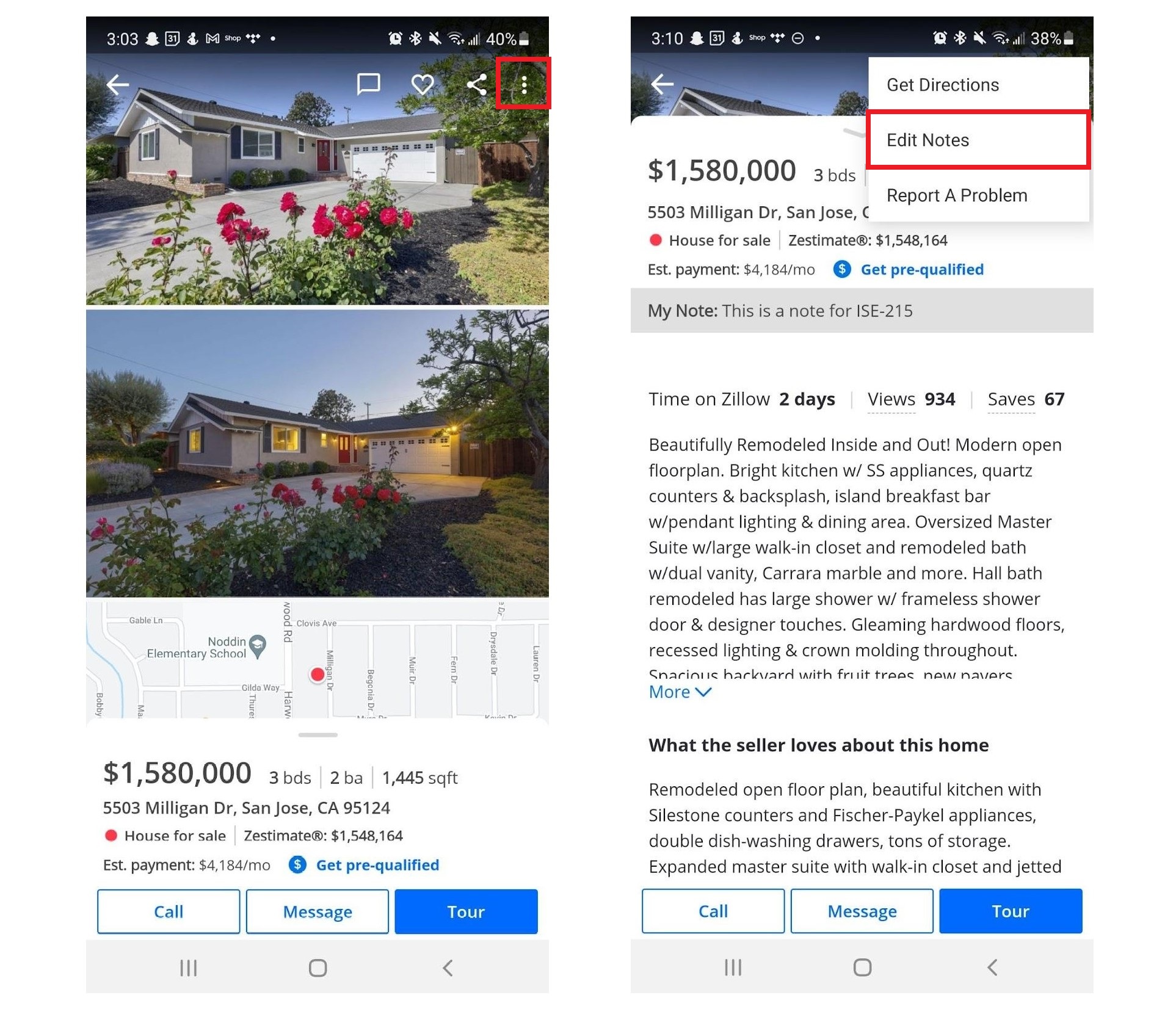
Save Notes - Participants had difficulty saving notes because it was hidden under the “More” icon. While 2 out of 6 participants successfully saved their notes on a listing, they struggled with accessing and managing those notes within the app.
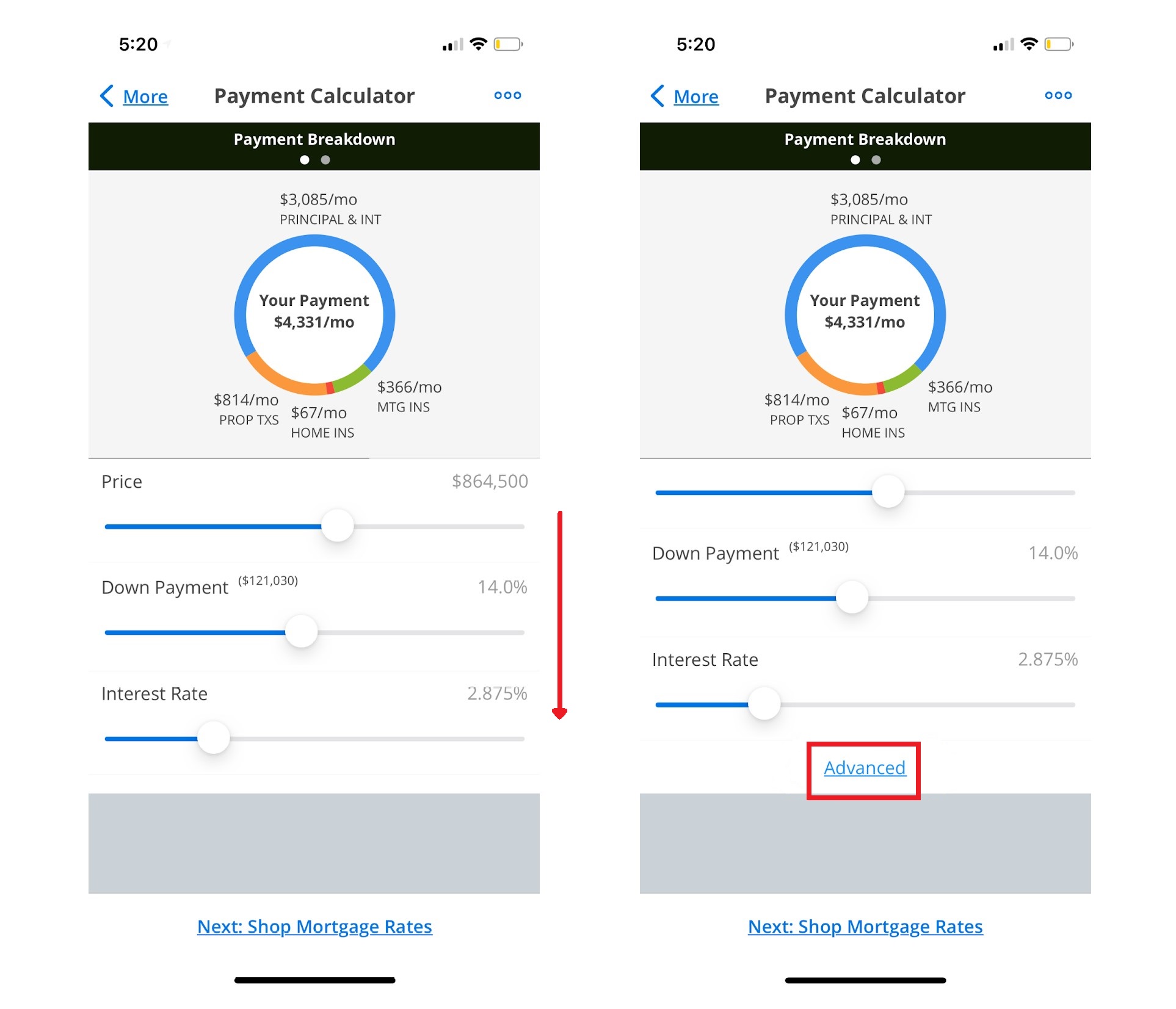
“Advanced” feature of Affordability/Payment Calculators - 2 out of 3 buyer participants struggled with a task using Affordability and Payment Calculators because they did not expect to find additional criteria under “Advanced” which is invisible unless they scroll down, impacting their discoverability.
Redesign: Proposed Solutions
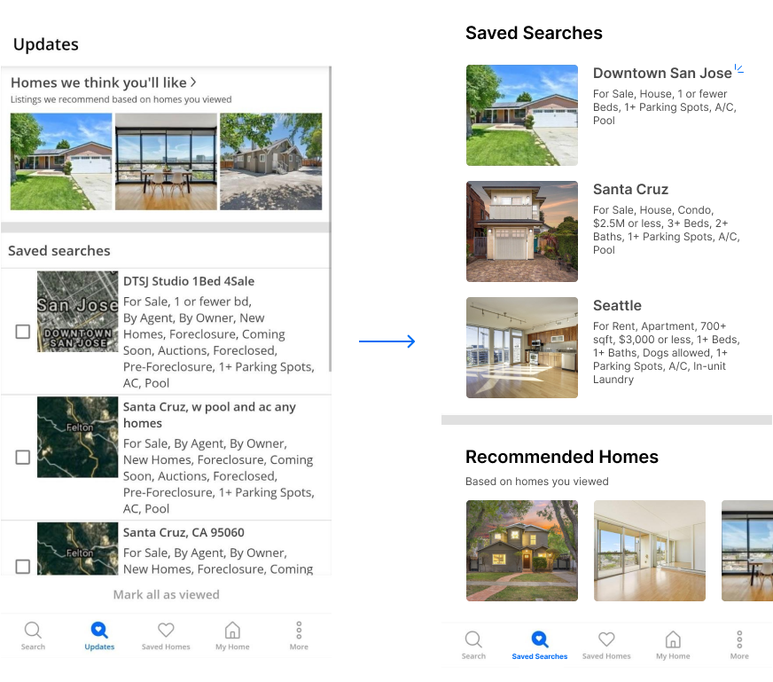
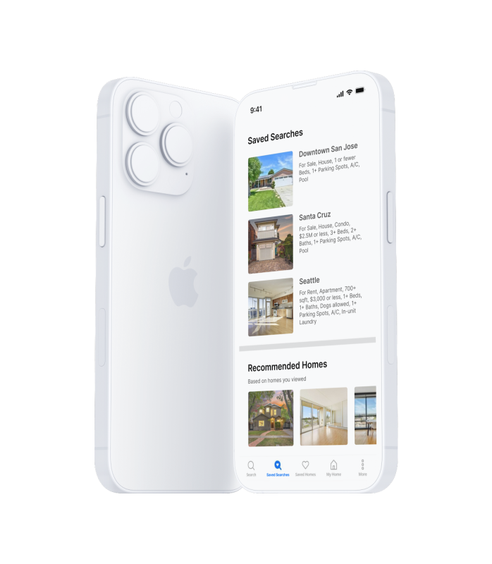
- Renamed “Updates” tab to “Saved Searches” to reduce ambiguity associated with the term.
- Positioned Recommended Homes below the Saved Searches section to better align the interface design with user objectives.
- Added an indicator (three blue lines next to the search title) for saved searches with updates.
- Incorporated more white space and consistent spacing between elements to reduce visual clutter.
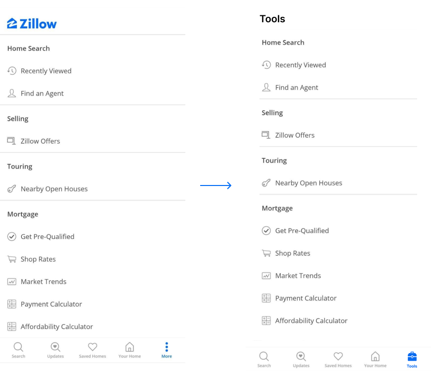
- Renamed “More” tab to “Tools”, accompanied by a toolbox icon, to clarify its purpose.
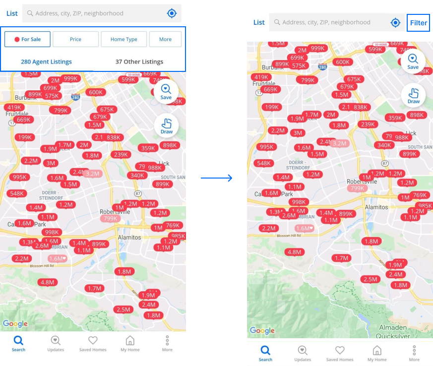
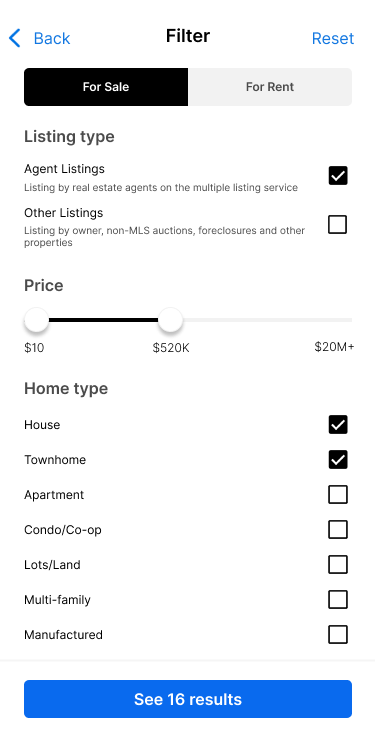
- Implemented a Filter button positioned in the top right corner next to the search bar, while removing previous filter options on the screen. By consolidating filters onto a designated screen, users can apply multiple filters simultaneously, minimizing the need for one-by-one selection and application.
- Added the Listing Type checkboxes as a filter criterion, each with a brief explanation, considering a use case where users seek to view all listings, encompassing both Agent and Other categories.
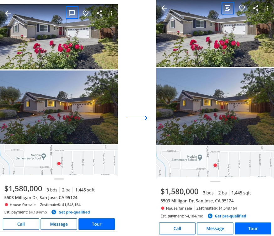
- Removed the Chat icon, as users can still access it via the “Message” button located under the listing description at the bottom.
- Instead, introduced a Note icon so that users can easily add or edit their notes.
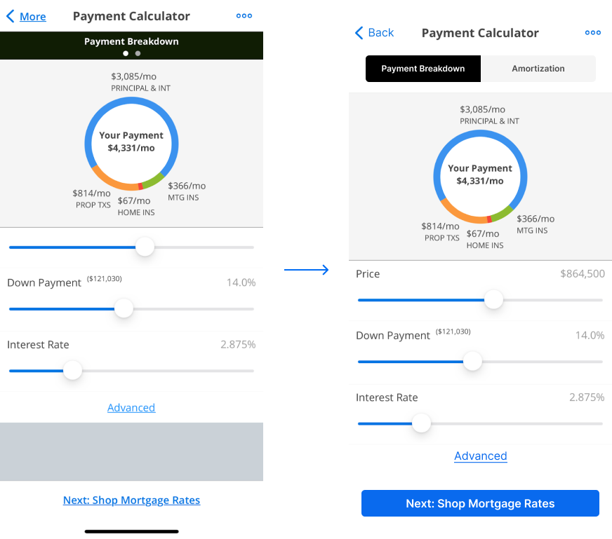
- Created separate tabs for “Payment Breakdown” and “Amortization” to address the issue of invisibility in the previous interface, ensuring easier access and visibility for users.
- Enhanced the visibility of the “Advanced” hyperlink by enlarging the font and incorporating more white space, making it more prominent and easily identifiable.
- Changed the next step hyperlink into a more noticeable button, ensuring it stands out for users.
Learnings
-
Teamwork is essential in usability testing.
Through collaborative post-session reviews and a comprehensive debrief, our team gathered invaluable insights that enriched our collective understanding. It was an enlightening experience where we validated individual observations and worked together to create a more cohesive and enriched project outcome. -
A pilot study before testing sessions could have been beneficial.
Reflecting on our initial study sessions, we noticed several tasks that were repetitive or had unclear instructions. Running a pilot study beforehand could have helped mitigate these issues, streamlining the process and ensuring greater clarity for participants in the subsequent sessions.
